Modular Type
Assignment
This project is literally just permission to play with type, and I’m happy to do just that. The assignment: uses modular letter construction as a jumping-off point to prototype our very own modular font. Let's go.
Playing with Modular Type
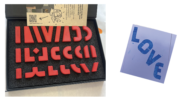
We got to go to the print studio in class and just mess around with modular type, which was a treat. I especially loved the block stamping. I made a card for my husband and, played with random letterforms. We also worked with Alpha Blox, which was a surprisingly collaborative and meditative process. It really clicked for me how much you can do with a limited set of shapes when working with these, the letterforms, the patterns, the little moments of "oh that's actually a letter now."
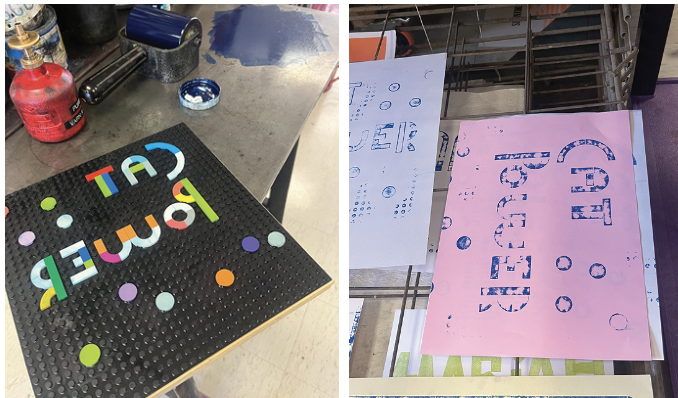
Then we broke out the Lego printing press. Full disclosure: my brain was partly at the Cat Power show that weekend, so I leaned into it and made a tiny poster as an ode to her. That was appropriately “salty.”
The next session, I came in a little more intentionally and actually thinking about form, and how I might be able to build something that's really mine.
Design Inspiration and Experimentation
Okay so. I am obsessed with the Bugonia movie poster. The typeface on it is entrancing and, naturally, it's not available for download because the universe is cruel and beautiful at the same time. It turns out it's one of “Joseph Churchward’s Forgotten Typefaces,” , made before digital type was even a thing that existed.
(Greek graphic designer Vasilis Marmatakis a longtime Lanthimos collaborator and type design apparent hero tracked down a specimen at the Museum of New Zealand Te Papa Tongarewa, got permission from the Churchward family, and digitized it for the film. Click the link above for or more info.)
I just want to make something that feels like a respectful nod to this and my other big inspiration is one of my all-time favorite animations: The Dot and the Line: A Romance in Lower Mathematics. My husband showed me this animation when we were dating, and it’s one of the many reasons I fell in love with him.
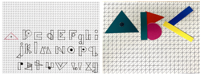
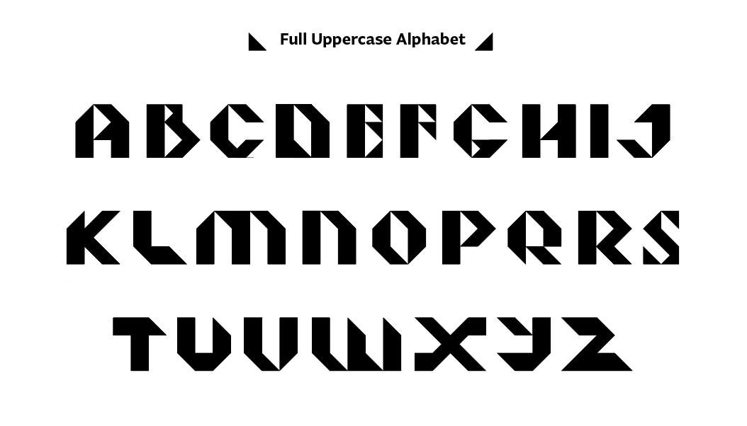
I briefly considered making the entire typeface out of dots, very Yayoi Kusama, something I've done before, but I think that would slowly drive me insane, and it didn't feel quite "in the spirit" of this project. So instead, I grabbed some grid paper and just started drawing letters with fun shapes. And somewhere in that process, it reminded me of a layout learning project I made for Design Pedagogy, so I decided to revisit those shapes and keep going.
From that project, I knew I wanted triangles, circles, and rectangles. How many base forms I'd actually need? TBD.
Concept Development
So I took all those shapes, like, all of them, and dumped them into Illustrator, added a few more, and started playing. I ended up with this wonderfully messy typeface that I genuinely loved, but that was... not exactly modular.
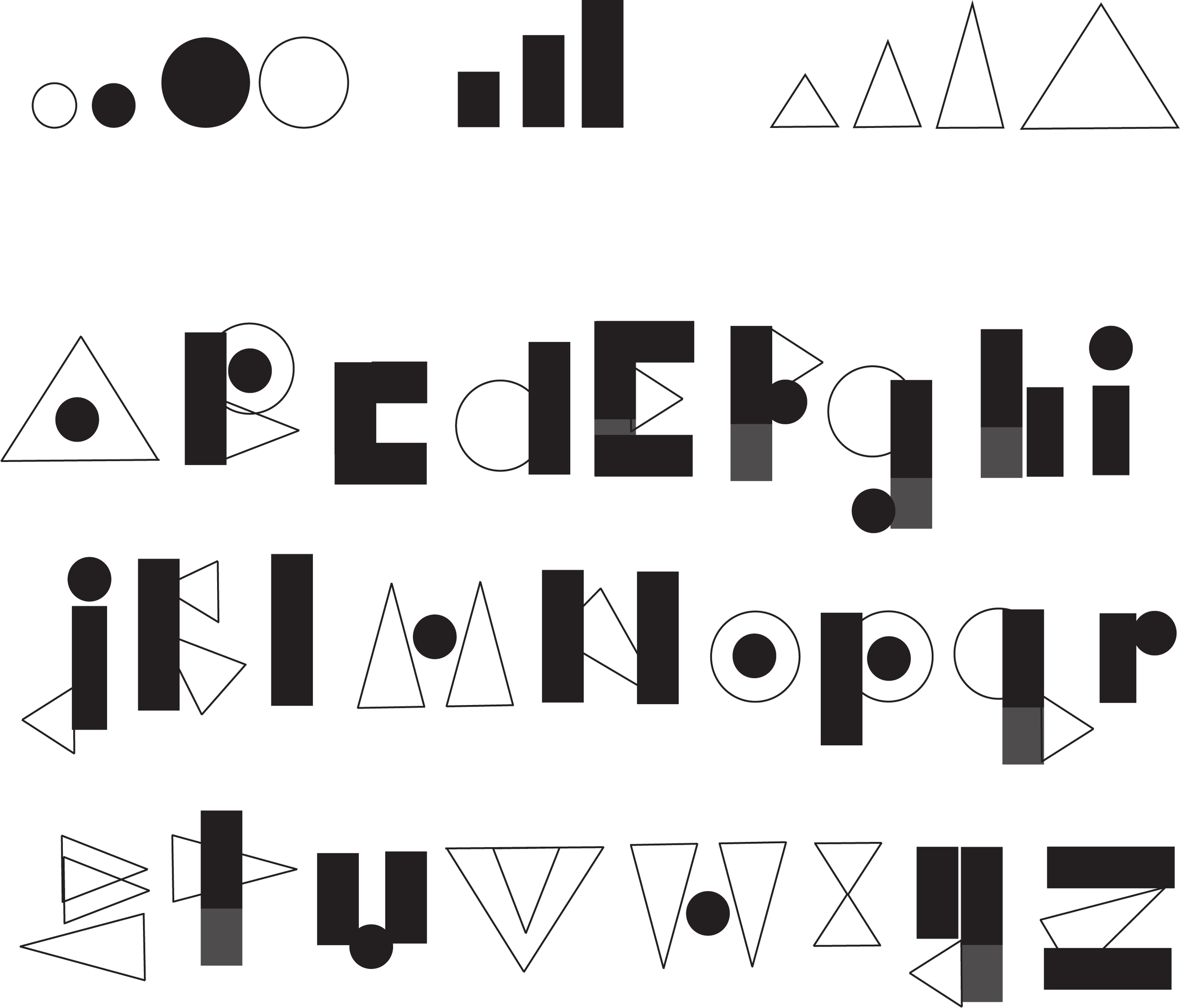
This is around the time I consulted Carley. I showed up with my fun shapes, and she hit me with a very calm, very decisive: "Girl, get back to the grid." And she was right! So I made myself a tidy little 5×5 snap grid and got to work. I took the original five-ish shapes and whittled them down until there was really just one triangle.
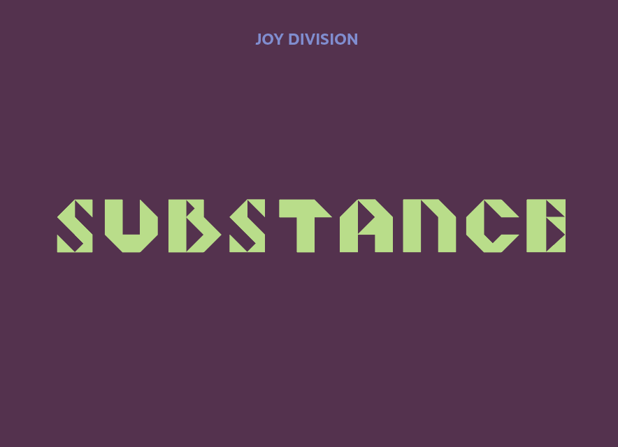
There was something genuinely exciting about seeing how few shapes I could get away with. It made the readings on Joseph Albers' type development and Wim Crouwel's New Alphabet click in a whole new way, like, oh, I was after the same thing they were after.
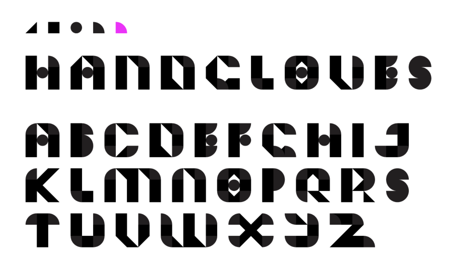
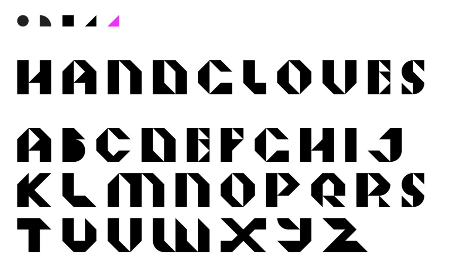
Class feedback helped narrow things down to triangles as the core unit and I just had to pull a handful of letter that were giving me trouble. I had the hardest time with the letter O and tried a lot of variations before landing on the right one, at which point I had internal moment of oh. that's it. why didn't I just do that in the first place.

After that, it was mostly refinement. One classmate caught that I'd left a curve on the "y" an easy fix, but a perfect reminder that fresh eyes are always helpful.
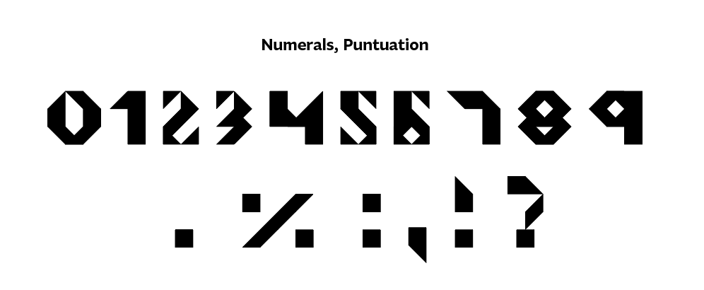
There was a brief crisis before I got to numbers and patterns, where I seriously considered scrapping everything and starting over with squiggles, because I was so deeply, tired of looking at triangles. Thankfully, I was talked off the ledge, and I'm glad, because building patterns out of triangles ended up being way more fun than I expected. Also: all those O experiments I'd done earlier? Surprisingly useful for patterns. Tried making faces too, less successfully, but we don't need to dwell on it.
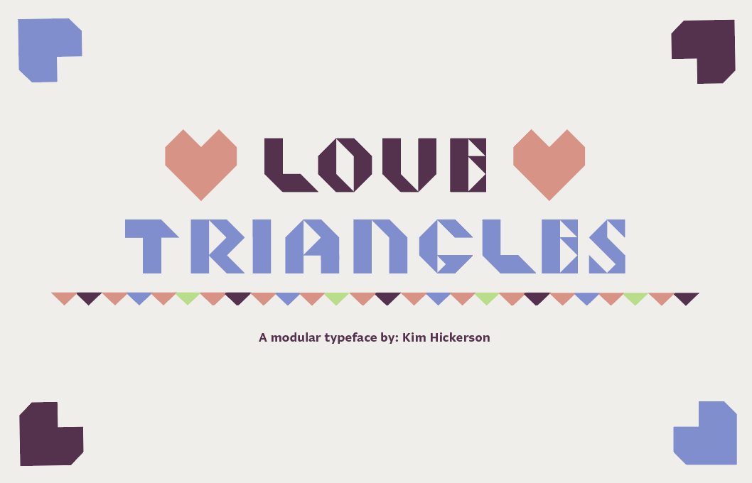
The title that came to mind first: Love Triangle. First thought, obvious choice, done, except it wasn't, because apparently there's already a font called Love Triangle that contains zero actual triangles, which is wrong. My second thought was Love Triangles so here we are with Love Triangles, and honestly, naming things is so hard, and my thesis project is proof of that, so I'm not getting any more complicated with this one.
I was in the home stretch, trying to finish everything up, and than I was held hostage by the number 6 for an embarrassing amount of time, but I got it. The 6 has been defeated.
Then I put the extended specimen book together using my process photos, scans, and, yes, asking my husband for his Valentine's Day card back because I forgot to photograph it before I gave it to him. From there, it was just a matter of following the instructions. InDesign is my safe place, so that part came together quickly, though one more review made me realize I hadn't actually played with the kerning, so I fixed that, contemplated my color choices for a while, and then just went with it.
I also somewhat randomly placed "Substance" by Joy Division in my file as a nod to the New Alphabet, a typeface designed by Wim Crouwel that we read about, and the one I realized was on the cover of that Joy Division album. Honestly, it never read as "Substance" to me all that clearly, so I'd always been a little curious about it. Here is my favorite song from that album to close: Love Will Tear Us Apart.