Catalog
Catalog Assignment
This project was about designing the look and feel of a faculty catalog for our newly established Department of Design.
Looking at Layout Designs / Grid Systems
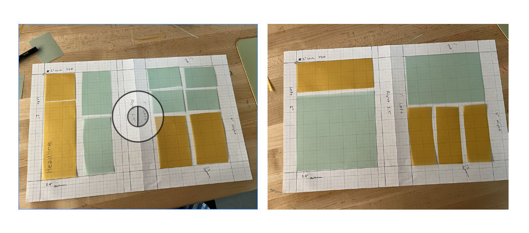
We learned about the history of catalog design, from Benjamin Franklin to IKEA. One of my personal favorites was always Anthropologie catalog, I also remember waiting months when I lived overseas in high school to receive the new Delia’s Catalog. We also outlined a grid system on paper known as Tschichold's "golden canon of page construction." Using this method we than than cut color blocks to play with layout ideas, which was an interesting way other than just wireframe sketching to experiment with layout design techniques.
Design Inspiration and Experimentation
We received our copies of the catalog content and branding files and we’re able to start desiging. I started with the idea of doing something really cut-out, zine-looking. I started playing around with that through some photo effects. I think it's a fun idea, but I would spend a lot of time in Photoshop and not in InDesign. I also think this would be a more appropriate look for, say, a booklet size where you can really lean into the zine aspect of it. I should also say I was partially inspired by these A24 zines that were really fun.
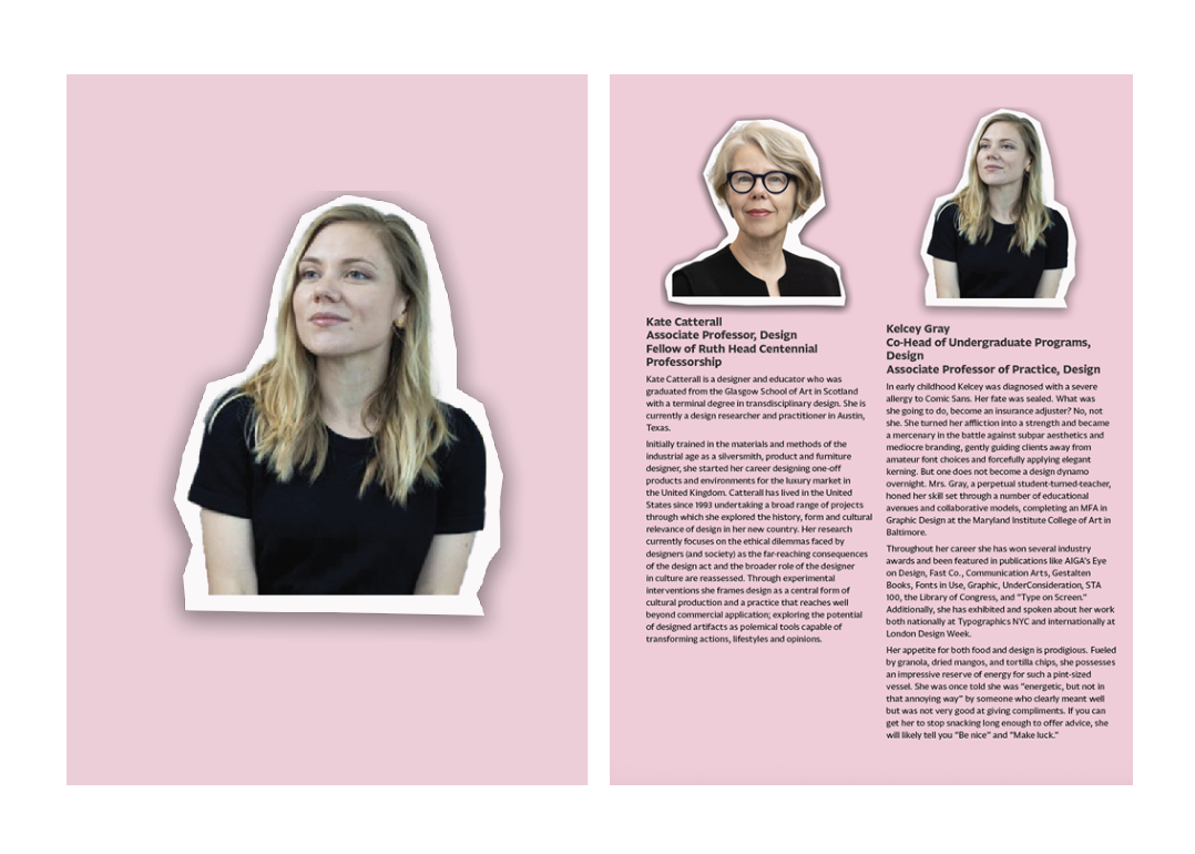
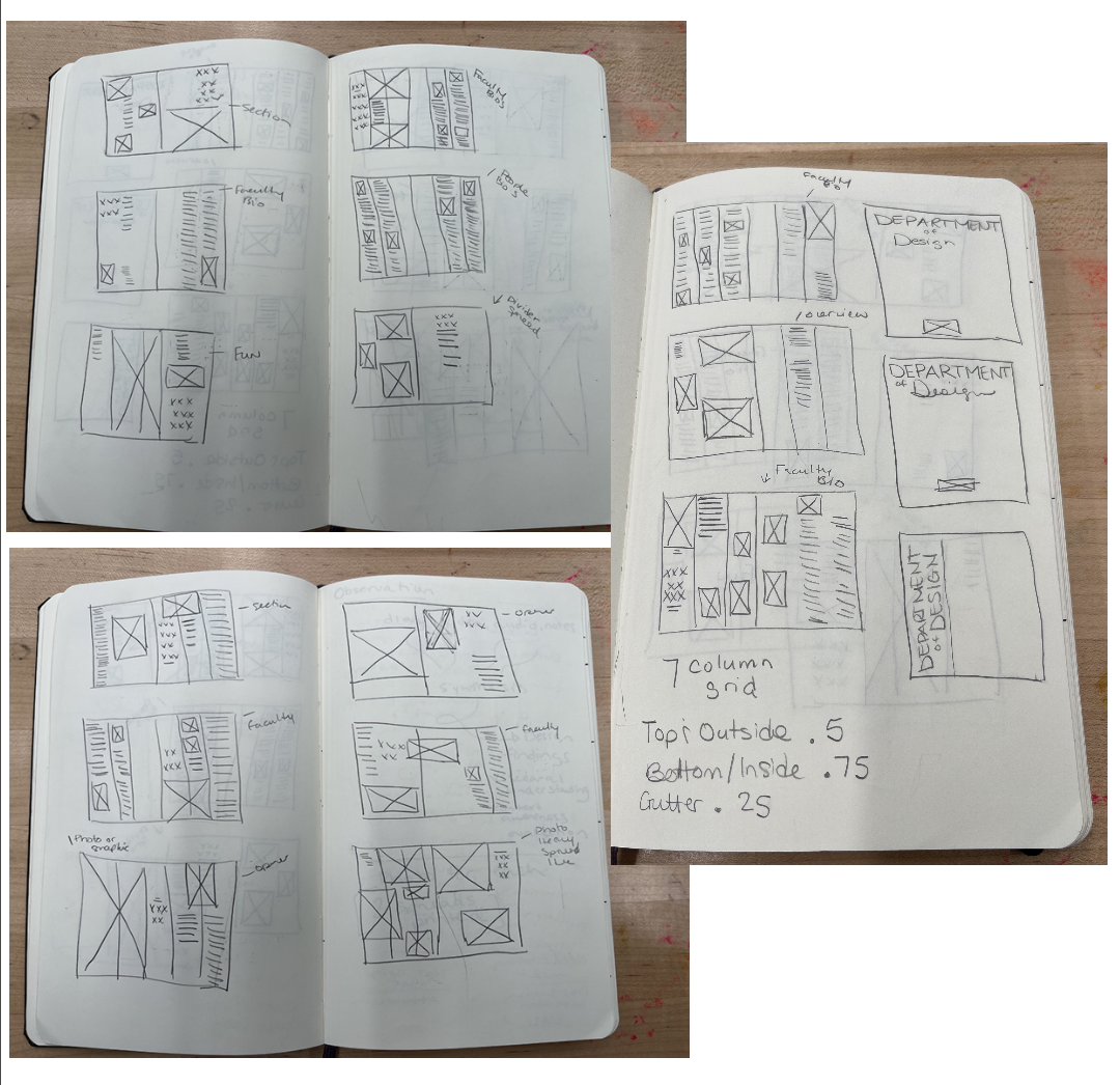
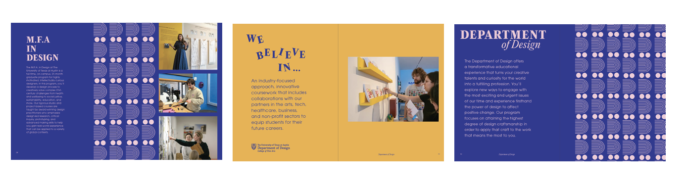
Then I went back to the drawing board, literally my sketchbook, and drew out some new layouts based on a more minimal look. I also felt inspired by Bauhaus-esque posters. Once I got those sketches on paper, I went back to InDesign and started playing with the layout. I knew I wanted to do something fun and novel with the "D" in Department of Design. I also spent a lot of time playing with the faculty page layouts.
Concept Development
It was really starting to come together at this point, but needed some refinement for sure.
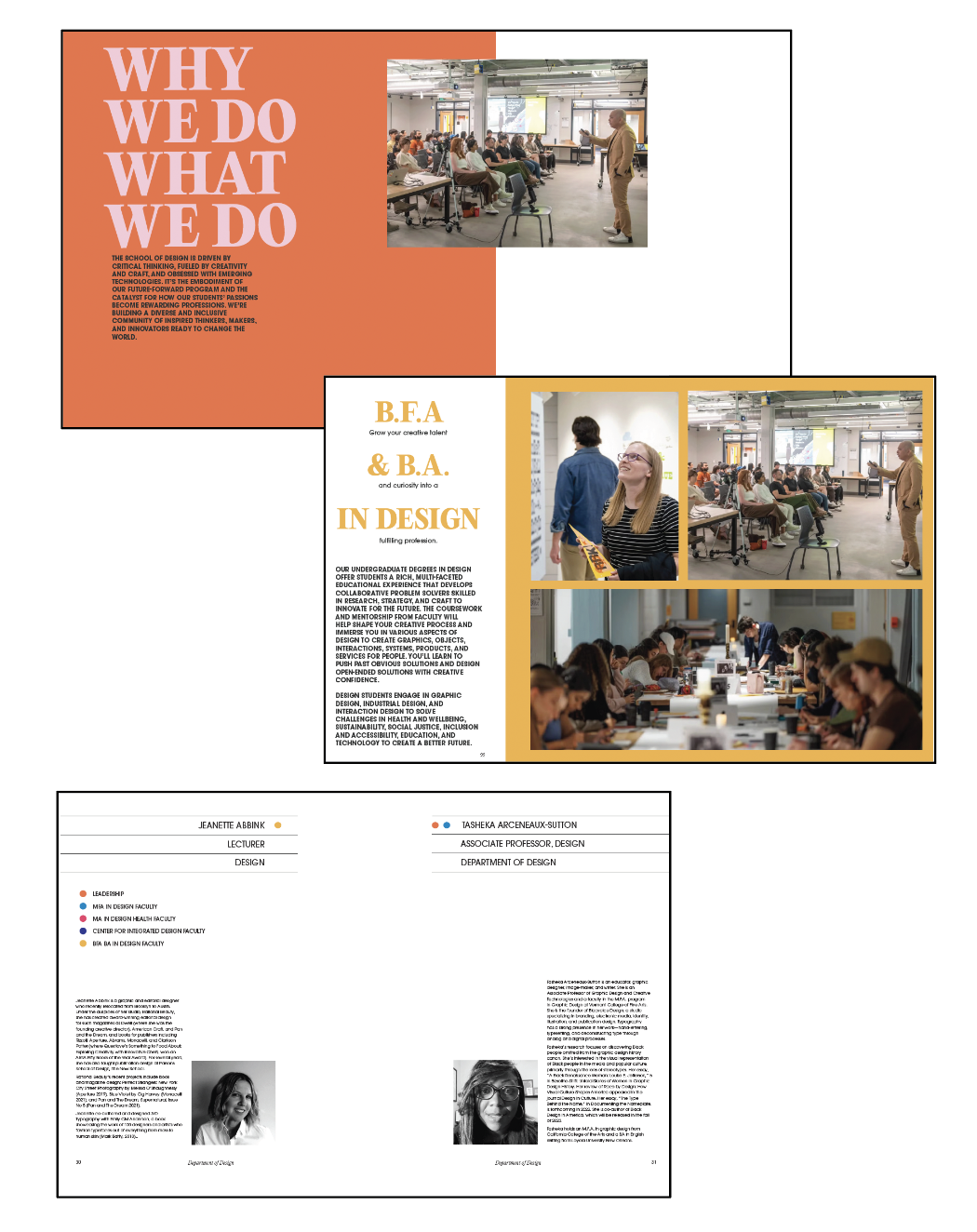
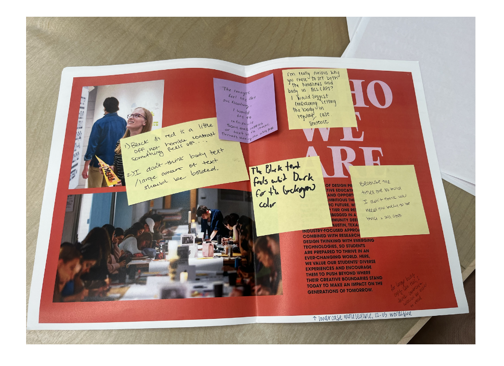
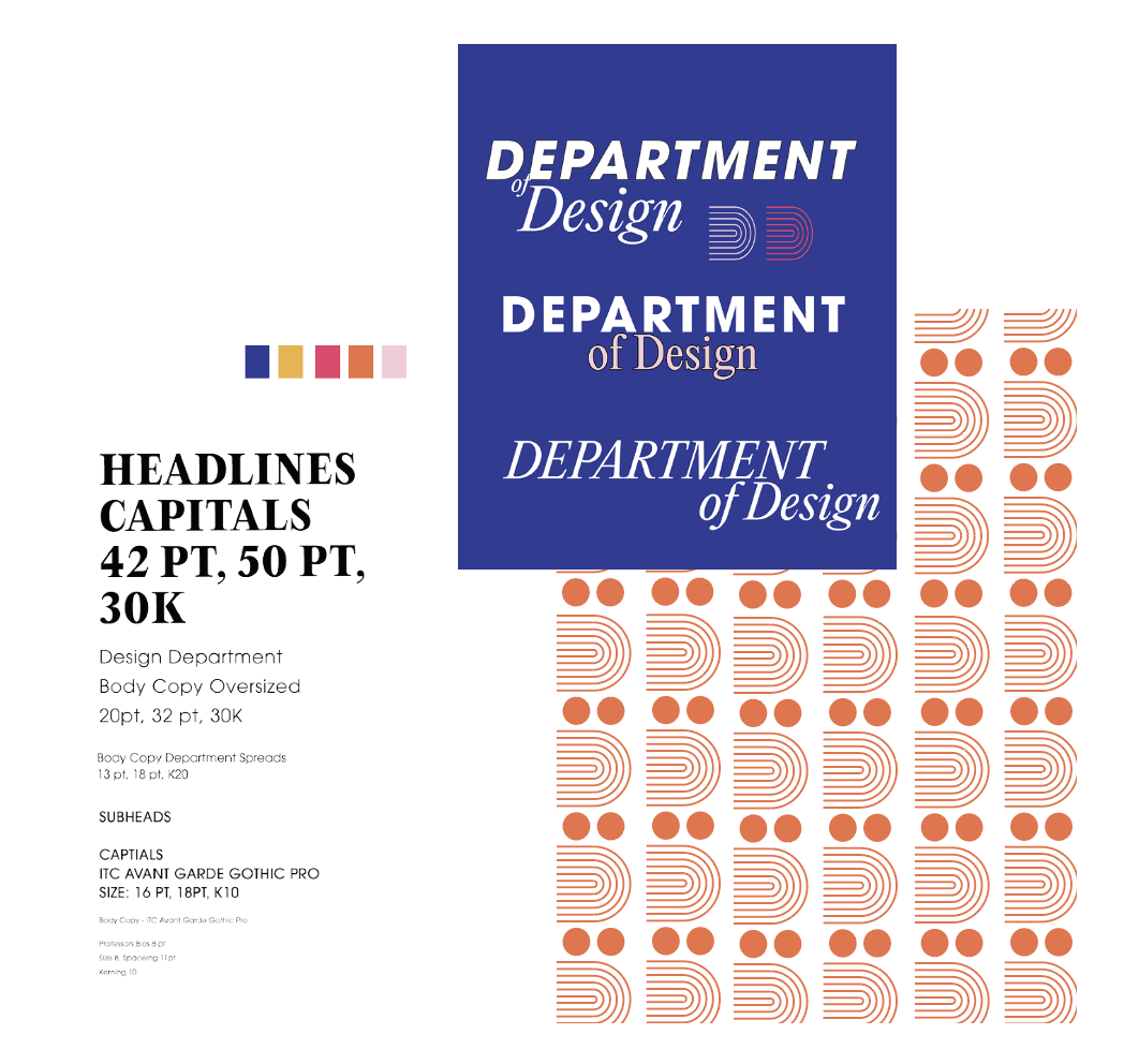
After getting some feedback I felt like the main thing I was hearing was obviously not to “all caps all the text” and to get away form using the black text with the orange. So I took that feedback made some adjustments and put together a style sheet. I also felt like it was looking a little plain so I knew want to do something Bauhous-esque with the D for the cover so looked for a pattern that would compliment that. I found this stock one on envato and modified it to fit my needs.
Now it was really taking shape into a satisfying finished project.
Final
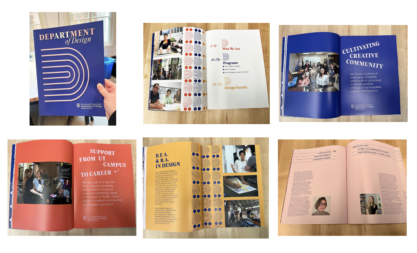
The last change I made was switching the faculty bios to a light pink background with blue text to give it a more cohesive look. Then I exported, went to Magcloud, and placed my order. Of course, the moment I hit "complete," there were like 5 things I thought of that I needed to double-check. I went back to my InDesign file and realized the master pages I'd set up were being blocked by all the color backgrounds I'd put together, so I went through and fixed that, along with two bios that hadn't converted to blue text for some reason.
Overall I'm happy with the results. I will say I'd make a few edits if I were doing a much larger print run. I actually think ordering a couple of professionally printed copies before committing to a larger amount is the way to go if you have time, especially if you're using a new, somewhat anonymous online printer rather than working with someone locally.
Here is what it looks like in print and below that a full digital flipbook of the finished catalog.