Type From Anything!
Type From Anything! | Spring 2026
tools used: book binding thread + making process + indesign
instructor: Carley Law
course: DES 335 Typography II
Jan 21, 2026 - Feb 2, 2026
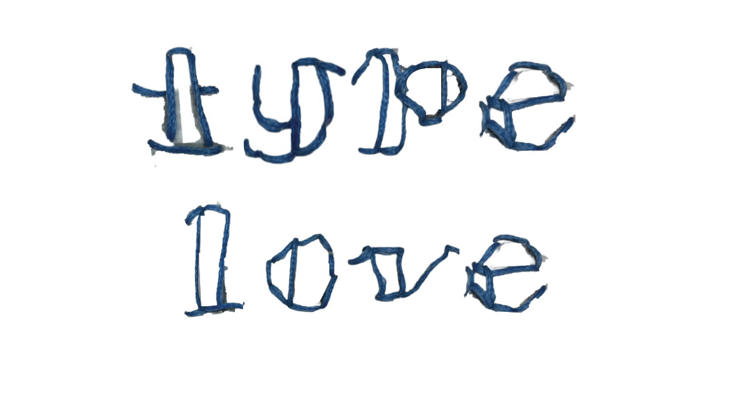
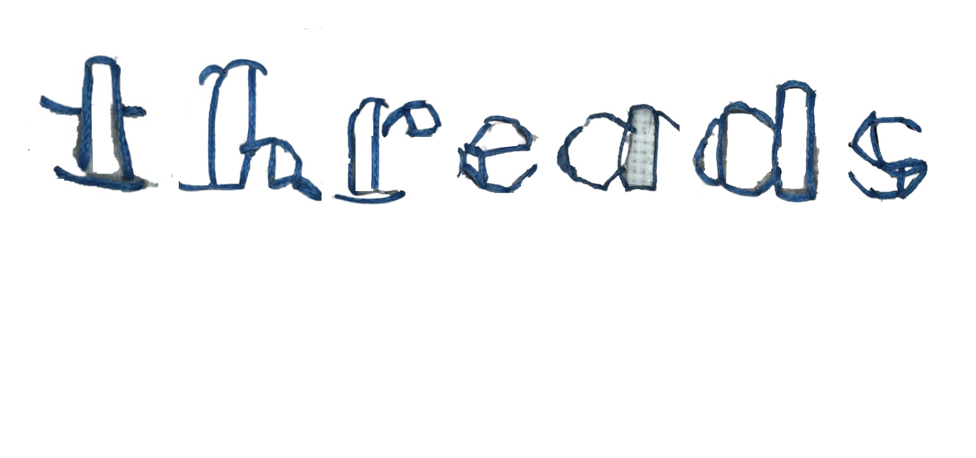
Using assigned found objects, which for me meant book binding thread we were tasked to create letterforms based on the physical qualities/functions. The purpose is to find some new relationship between the object and type/typography.
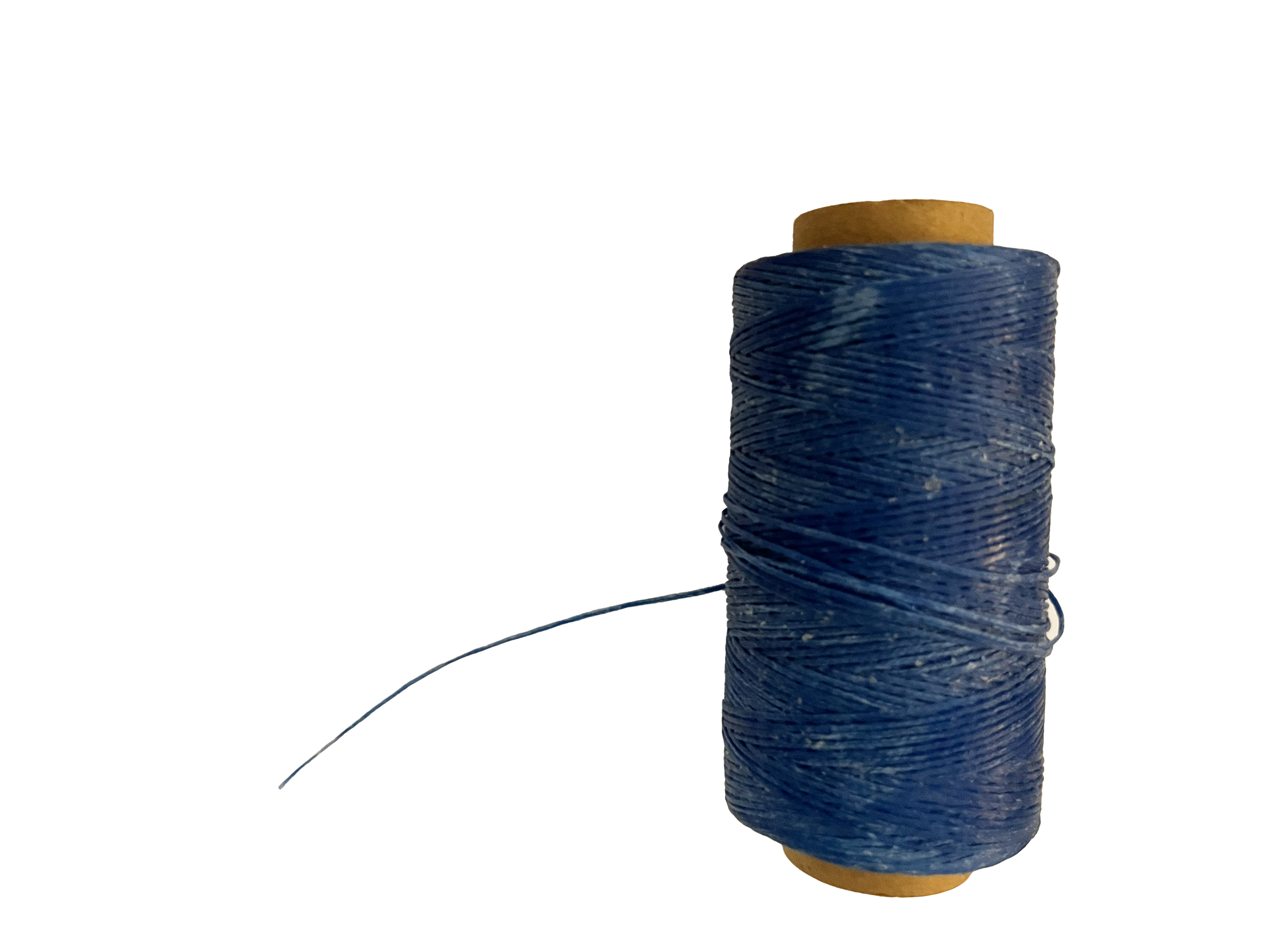
Material: Binding Thread
Qualities: waxed, linen, strong thread, durable, high-quality
Functions: bookbinding, crafts, quilting, plant support, decorative details
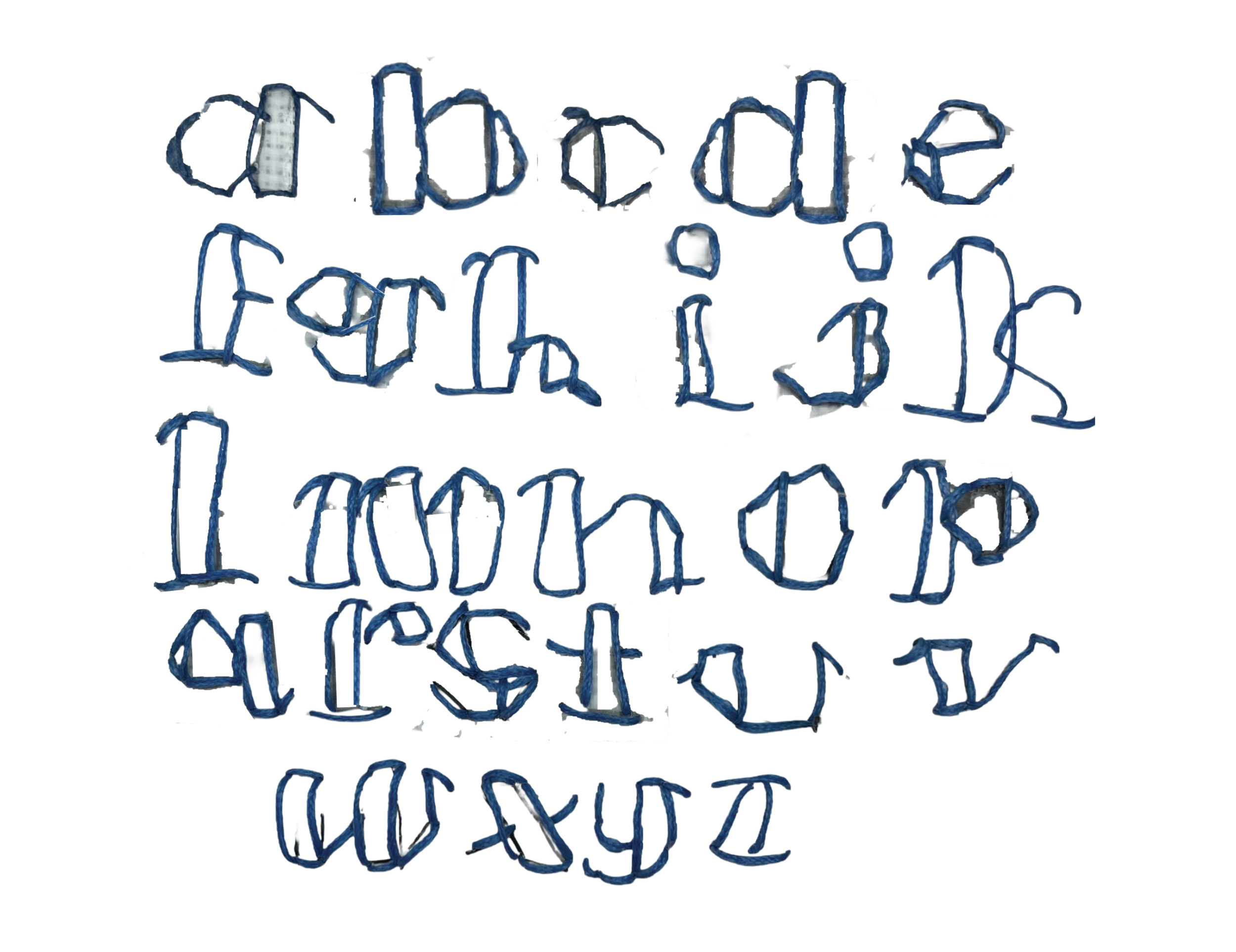
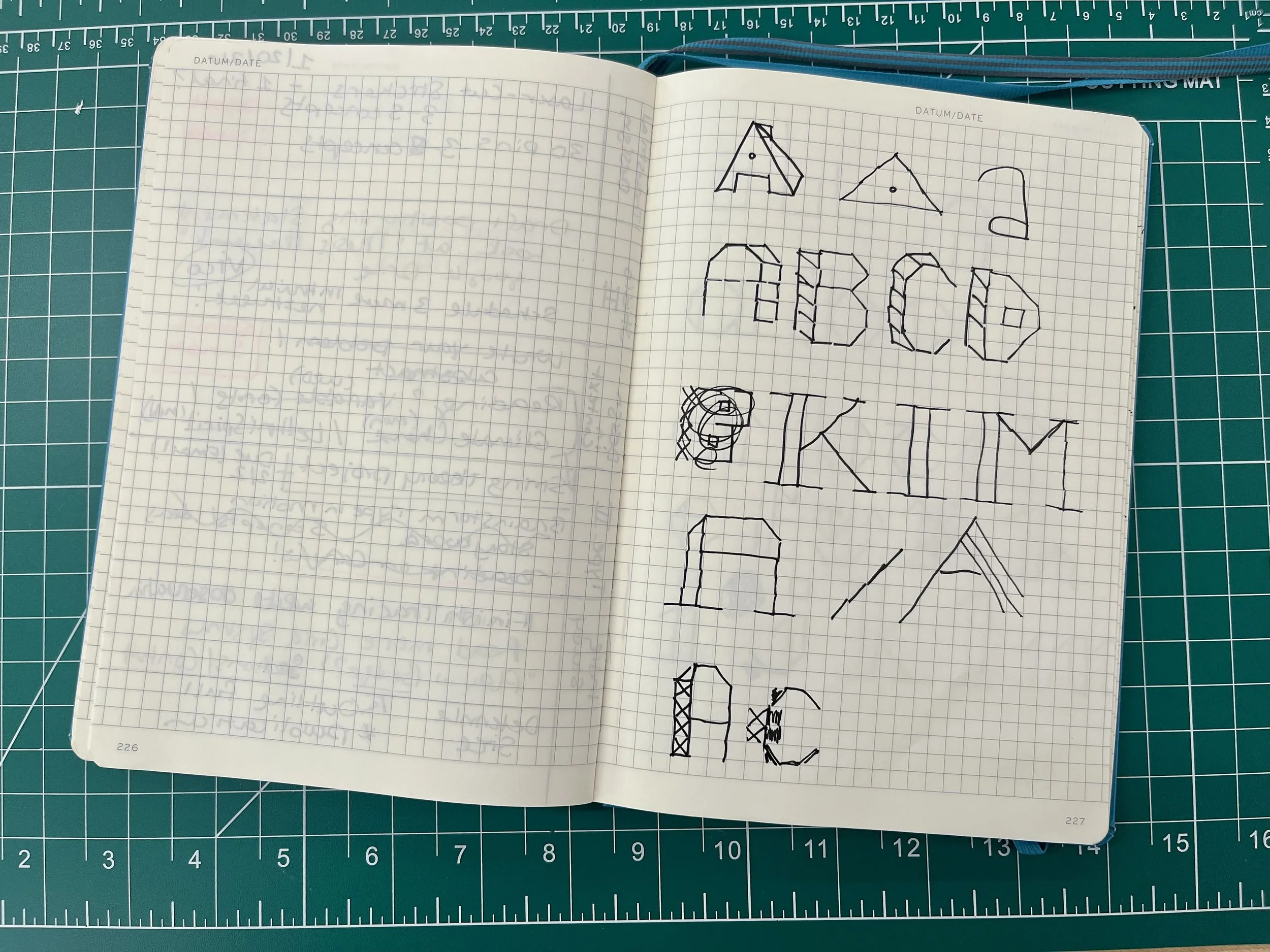
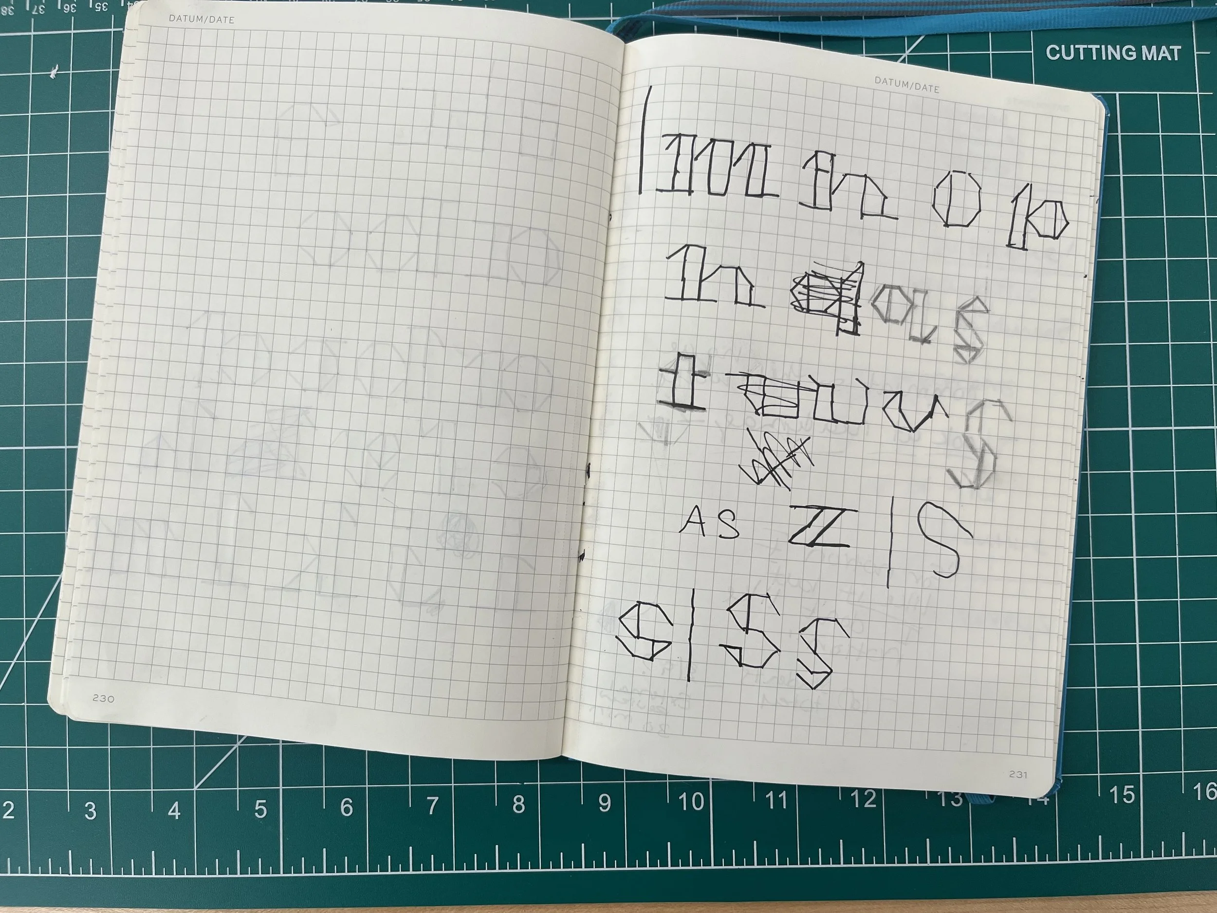
I initially considered gluing or pinning the piece because of the stiffness of the thread, but since I hadn’t worked with bookbinding thread before, I explored exposed spine bindings and other references. After reviewing samples, and photos I decided to experiment with kind of cross-stitching letter forms using the thread. Instead of a traditional X pattern, I chose to focus on straight-line stitches. I researched and sketched various versions of stitching patterns, refined the sketches I liked most, briefly explored a capital-letter version, and ultimately chose a lowercase form that better fit the concept. You can see in my images that “s” gave me the hardest time to compose.
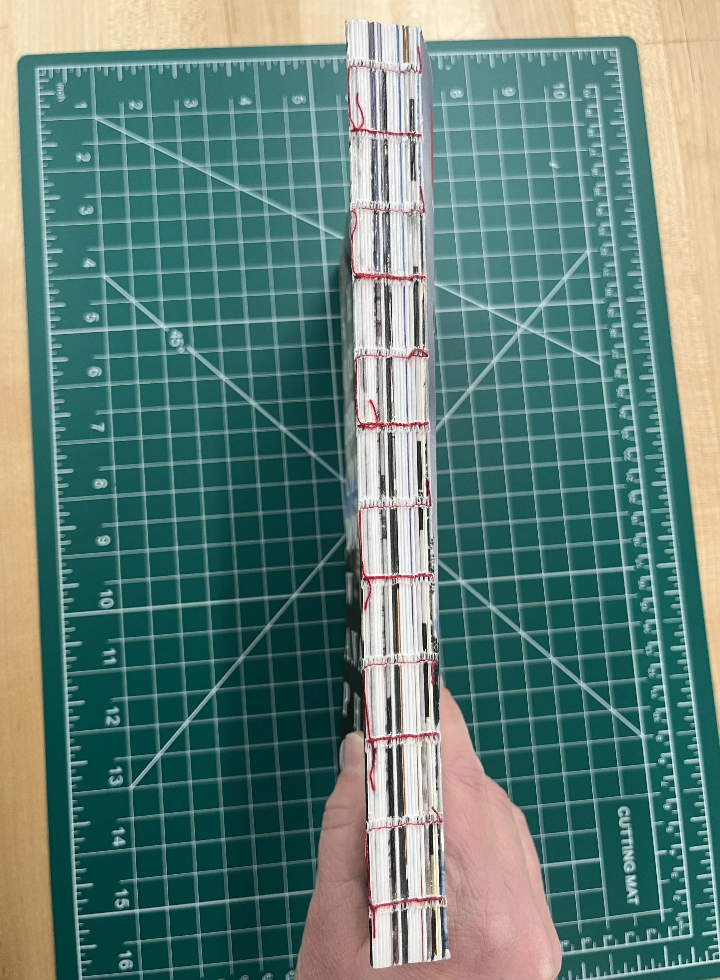
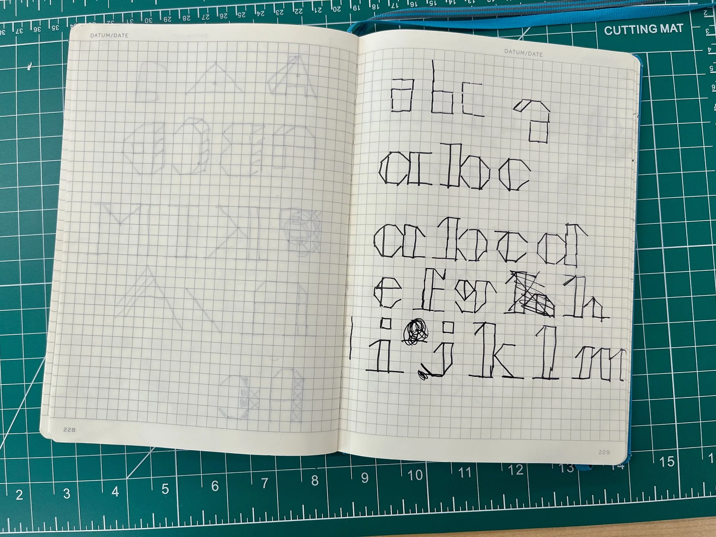
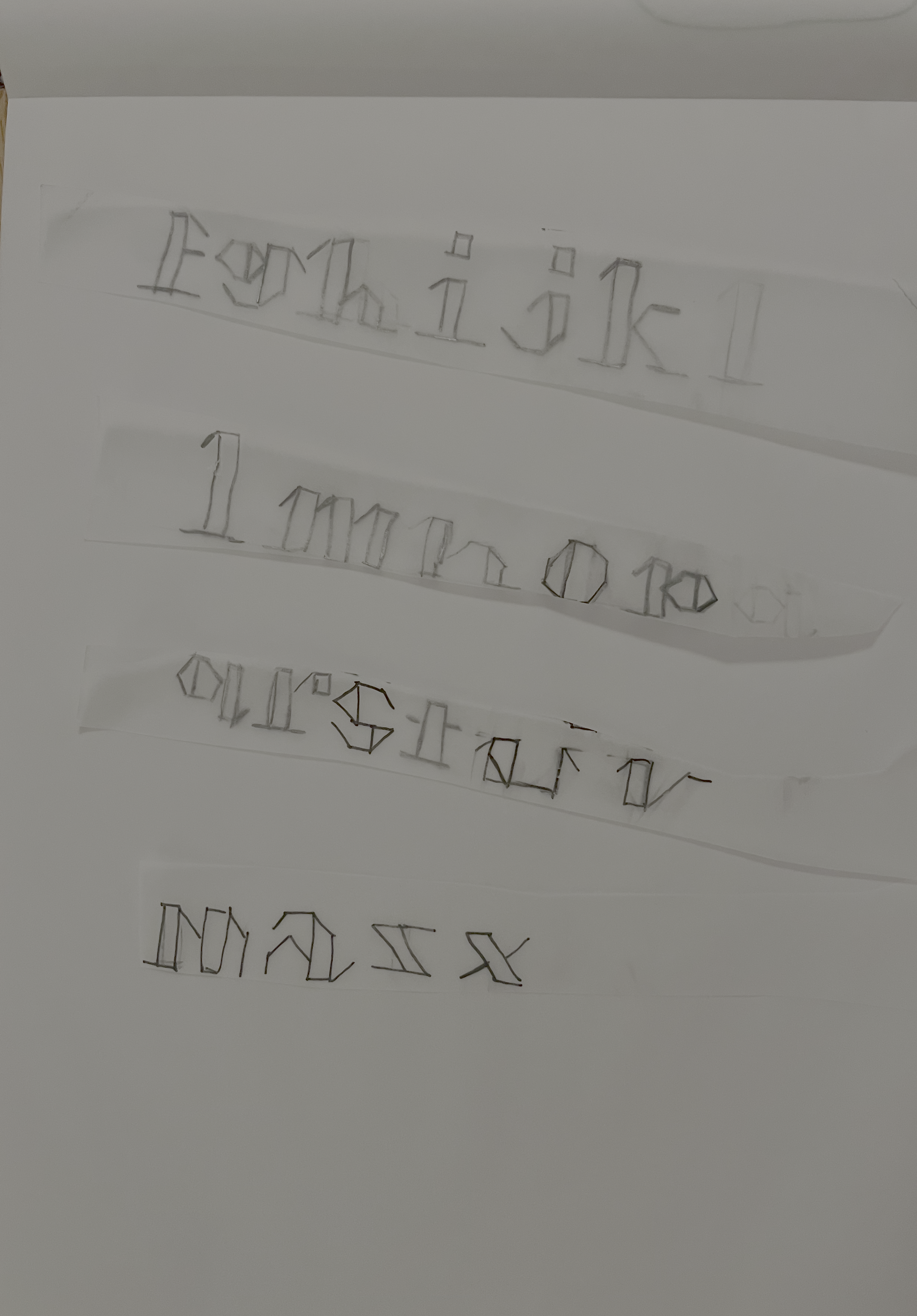
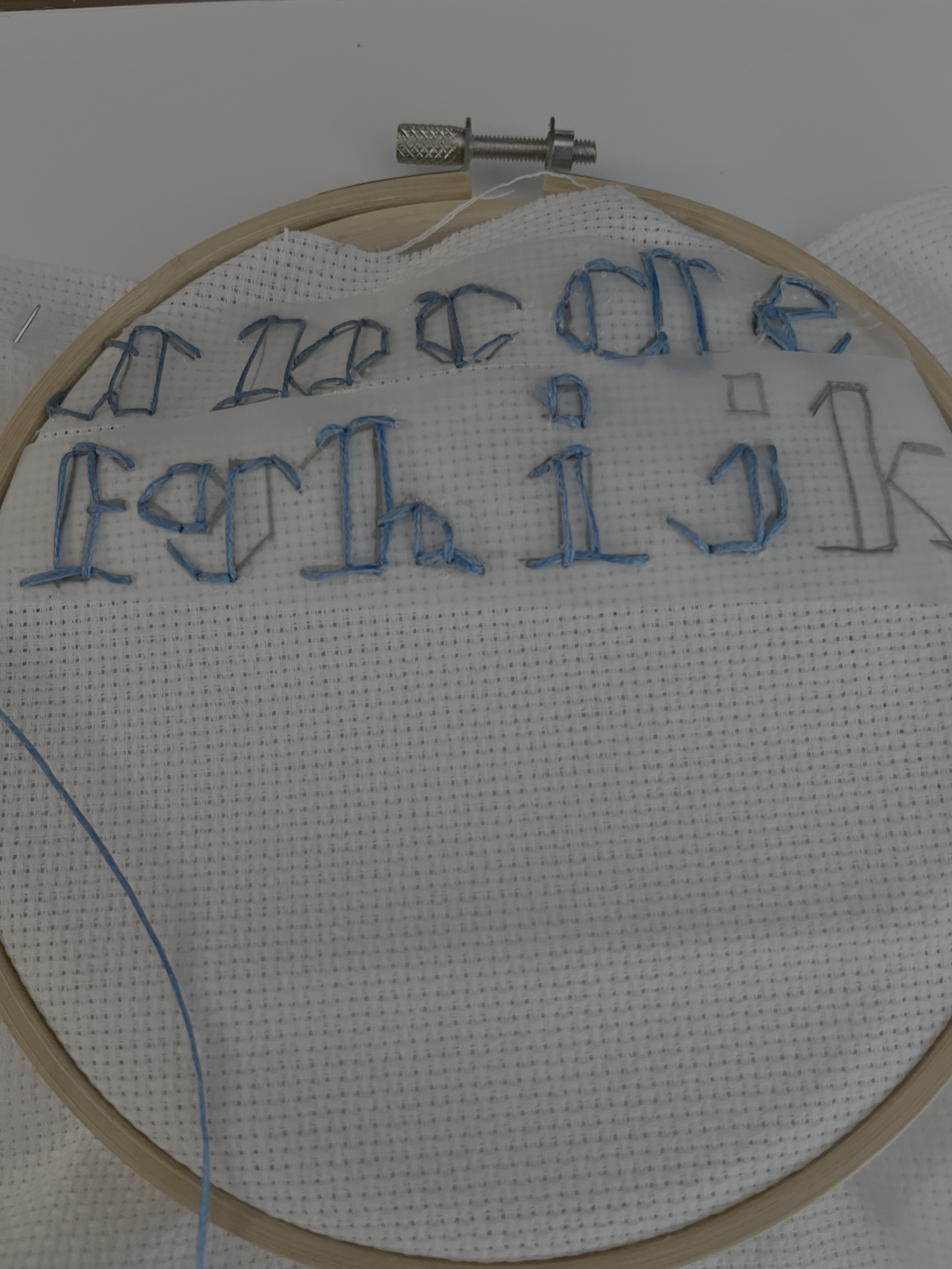
Than I did the full specimen on tracing paper so I could use that as a guide for stitching the letterforms. Then I spent a bit more time than I expected stitching, and stitching some more until it was complete.
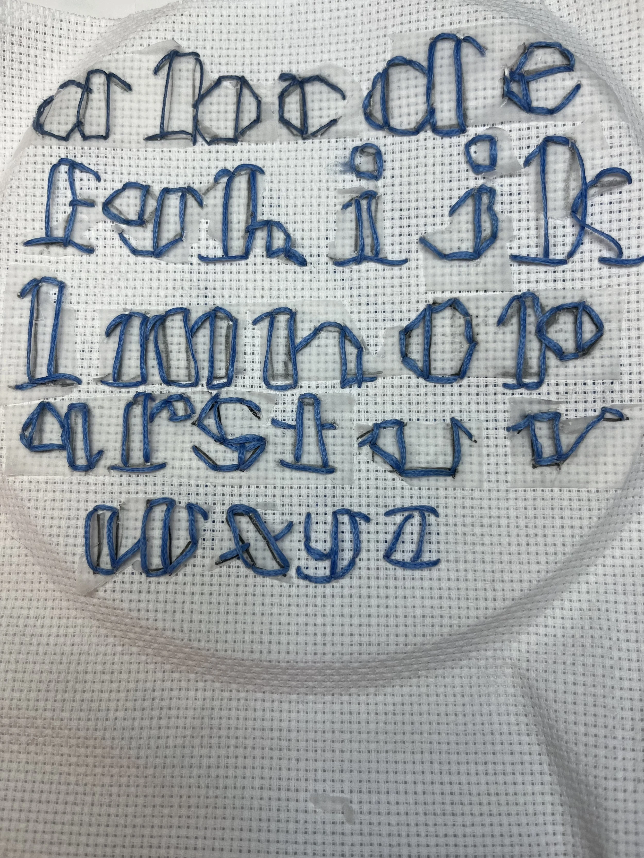
Then I photographed the piece, removed the background in Adobe Photoshop, and did a bit of cleanup to refine it. The full specimen is fairly rough, but there are elements I really like, especially that even with a clean background, you can still tell this is real thread, not a mock-up.
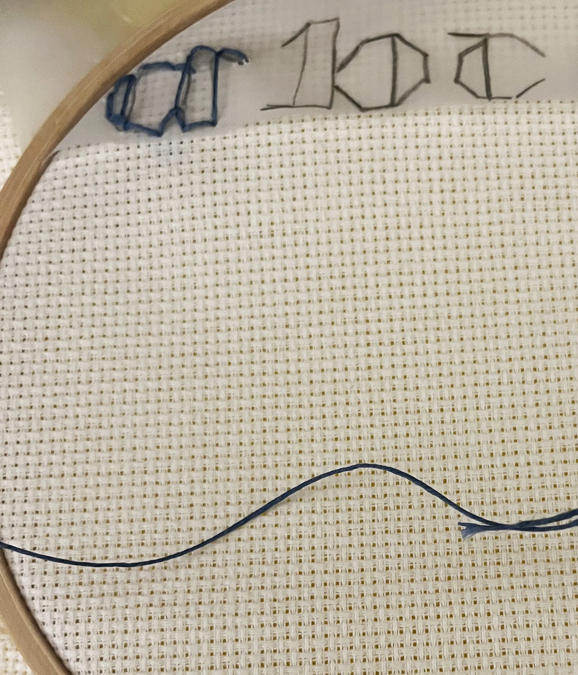
If I had more time to do this again, I would trust my original idea of using the cross-stitch fabric as a built-in grid instead of tracing paper. The tracing paper ended up being harder to remove, both physically and digitally, than I expected. You can where I free-handed the last three letters “x, y, z” stitching, and overall that approach probably would’ve been the better route.
That said, I’m still happy with this first attempt. It has a handmade quality that feels effective. A lot of the “thread” fonts I looked at are attractive but clearly simulated this keeps an analog charm that feels more honest and imperfect in a good way.